CREATIVE BRIEFS
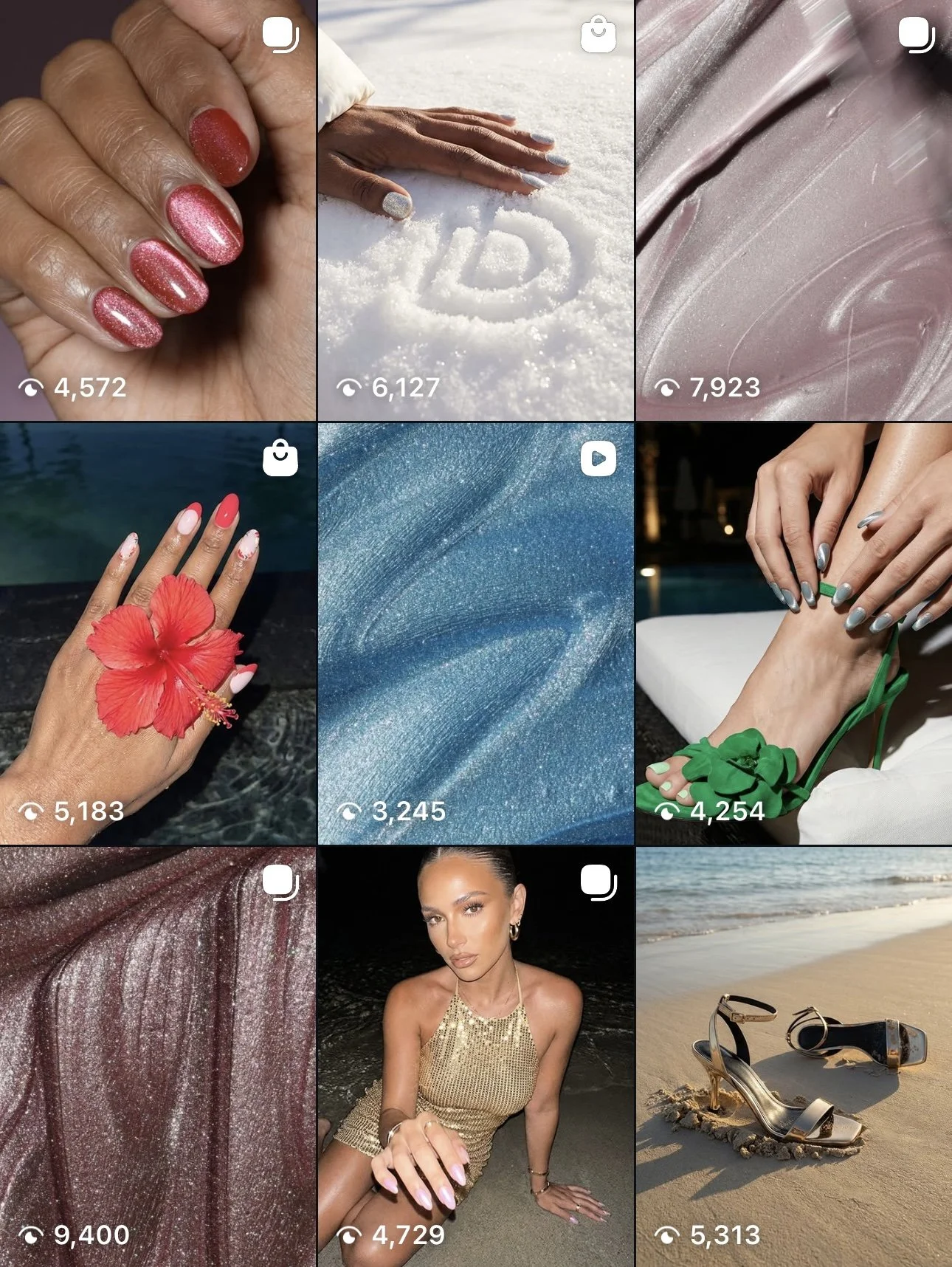
RESORTWEAR SS26
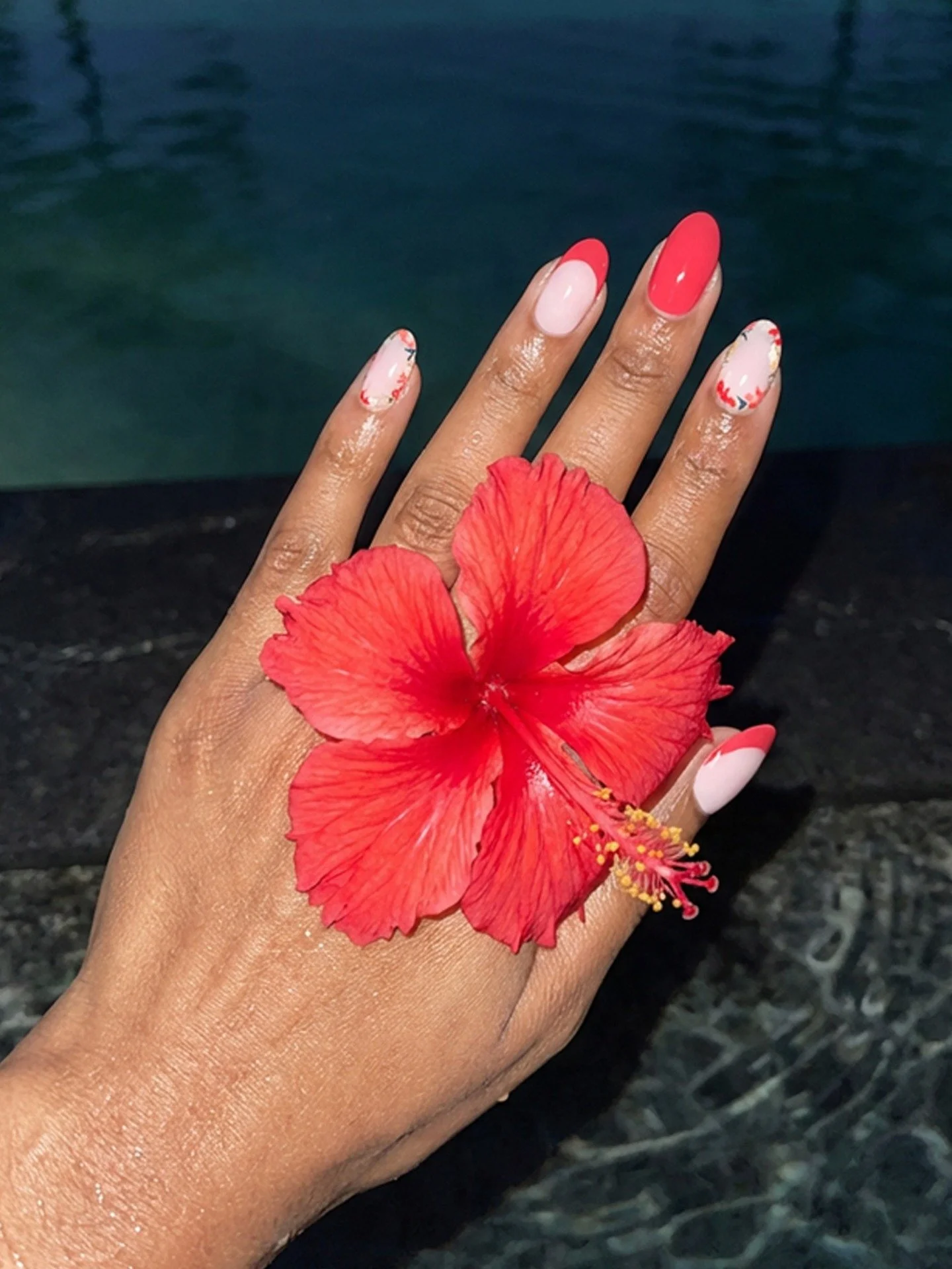
The color palette in this collection is probably the furthest thing you’d ever associate true runway Resortwear with, but it was a makeshift collection curated from existing styles with the objective to reposition them in a more attractive way and sell through their inventory.
But to be honest, neons are way cooler. And guess what? It worked.
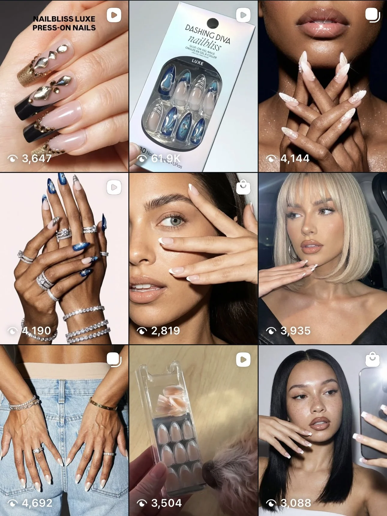
DON’T PARDON MY FRENCH
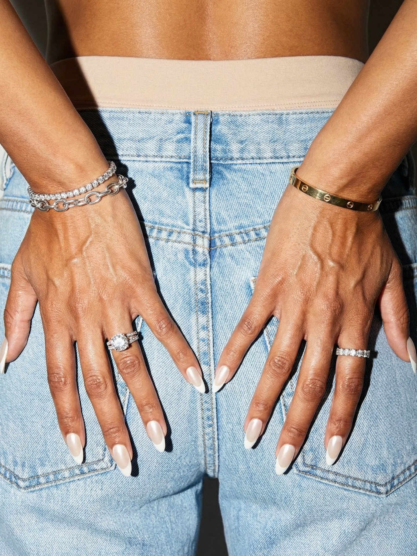
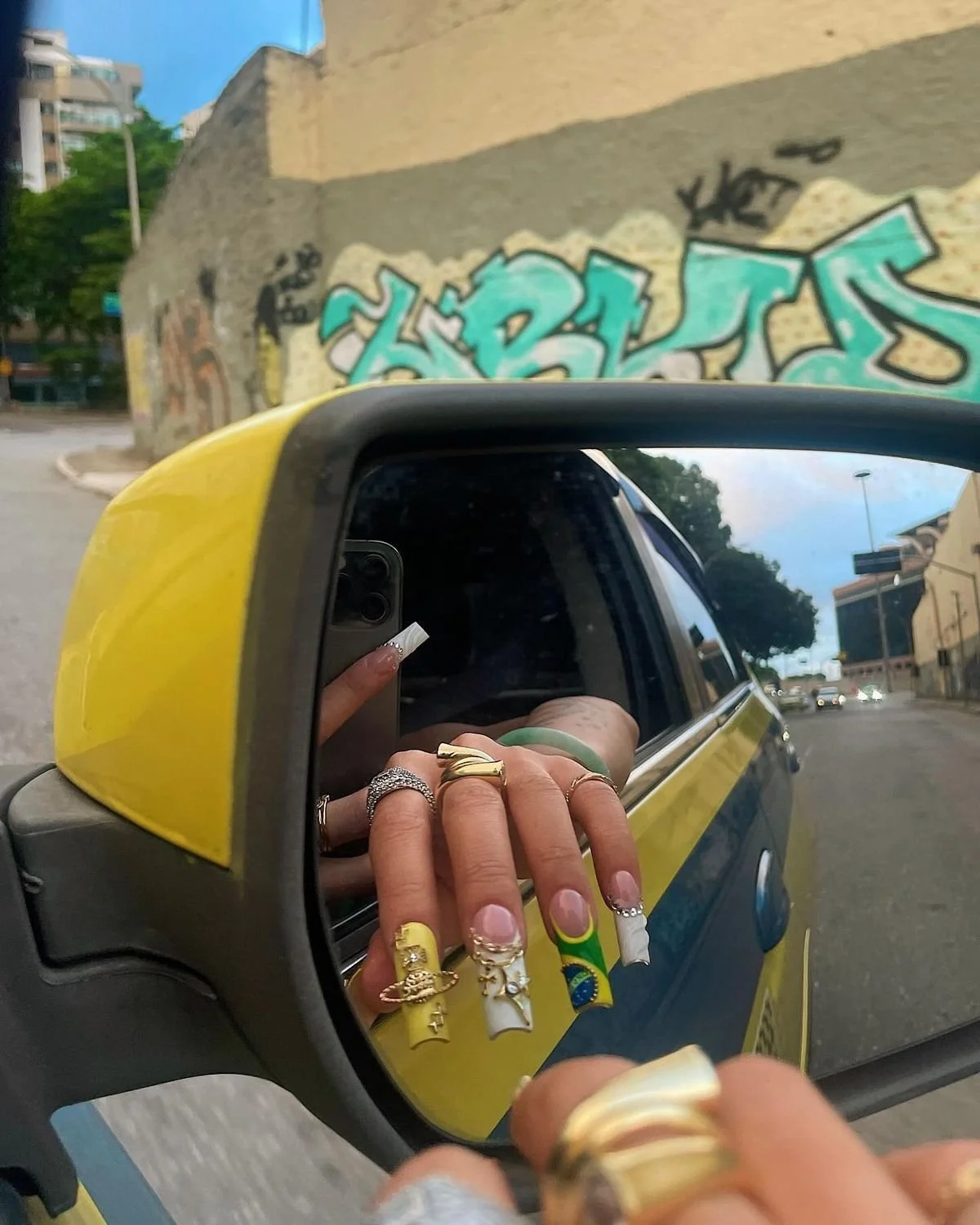
“Don’t Pardon My French” was built around the confidence of having the most expansive french assortment in the nail category. The typical “timeless, classic” messaging that always orbits the french manicure didn’t work for me. I wanted to go bolder by subtly saying “don’t mind us being the best.”
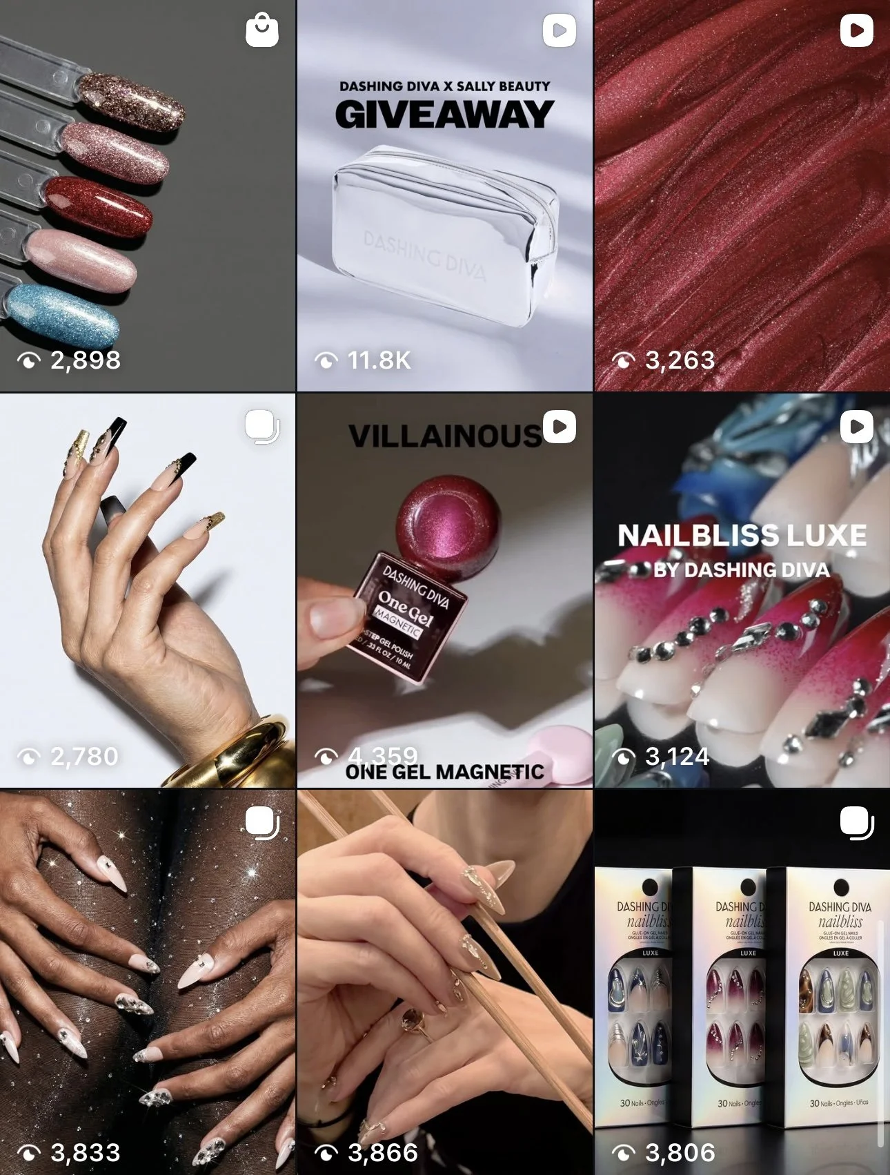
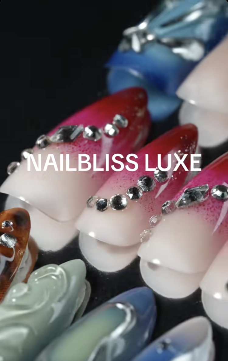
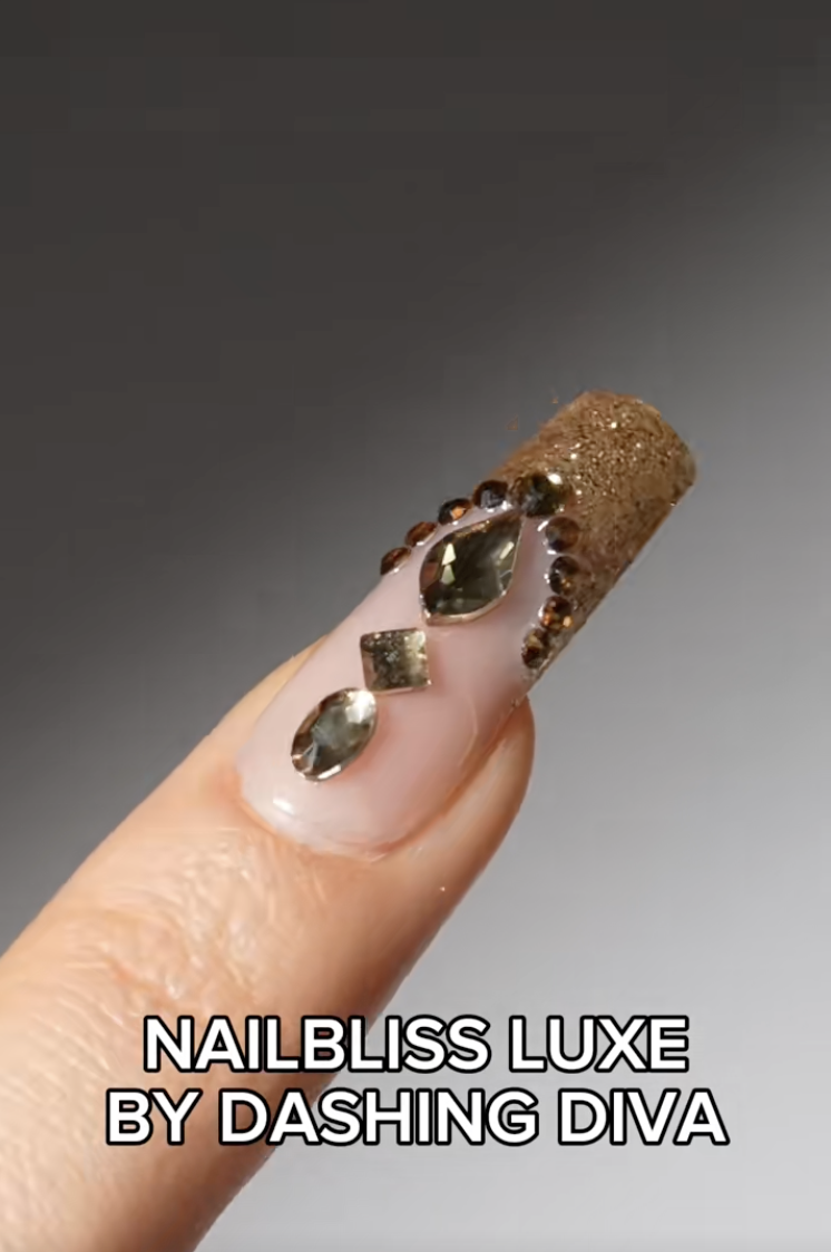
NAILBLISS LUXE
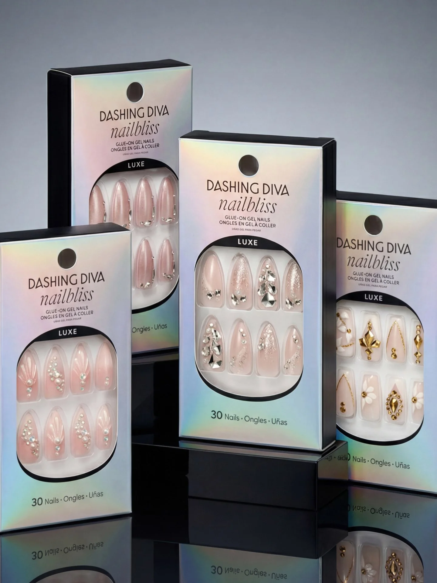
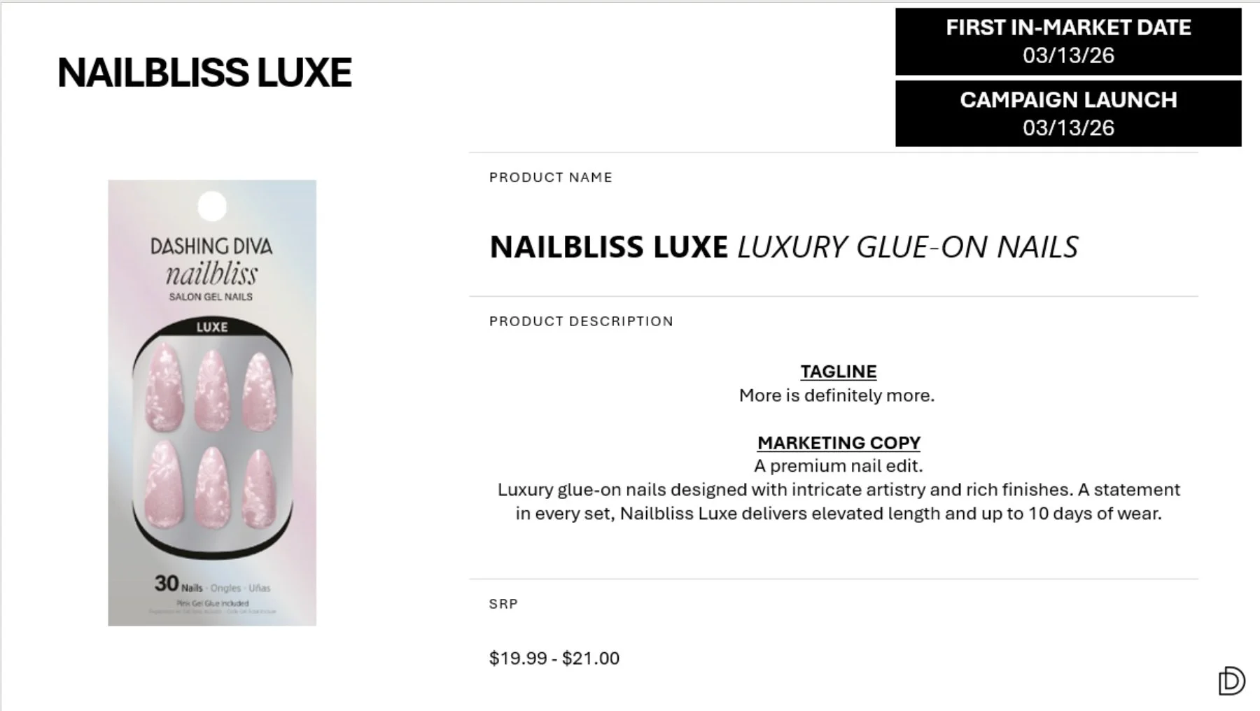
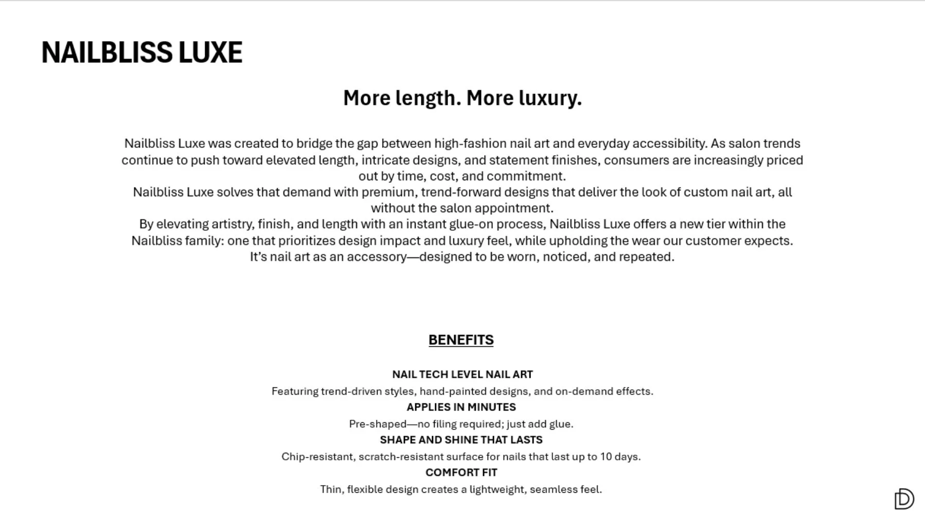
Elaborate nail art has been on the up & up for YEARS, while the economy has been trending the complete opposite way. Nail tech prices are rising and the mass market simply can’t keep up right now. They’d turned to press-on nails, but there was a clear gap between the styles they desired and what was actually available on shelves. Until Nailbliss Luxe.
GOTTA JET!
This campaign was so much bigger than another summer campaign. My vision was to position it in a way that felt familiar first with the season as an afterthought. Back to the topic of the downward-trending economy, it’d be completely tone-deaf to roll out a luxury travel collection and incredibly boring to photograph bright nails next to fruit once again. This one was for returning to homelands and seeking out comfort—rather than luxury—and all the micro moments in between.
CAMPAIGN COPY
NAILBLISS LUXE
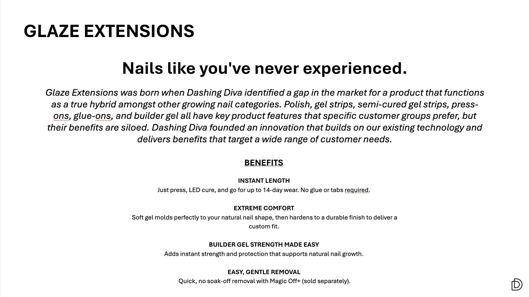
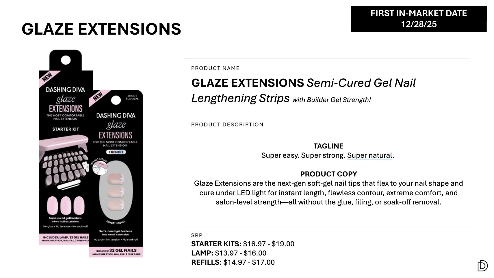
GLAZE EXTENSIONS
VIDEO SUPERS
-
![]()
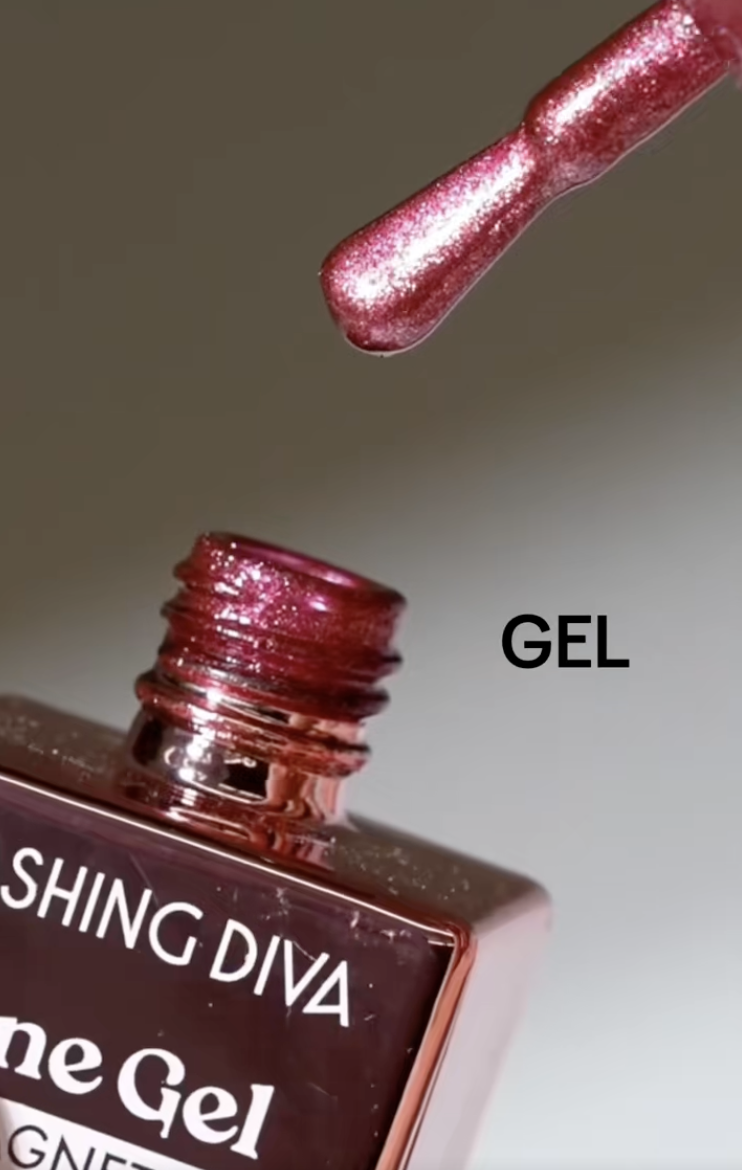
HOW TO APPLY: One Gel Color (Gel Nail Polish) by Dashing Diva
-
![]()
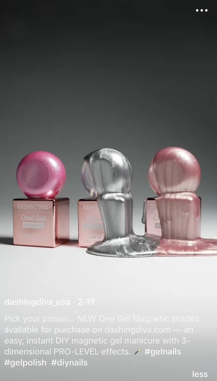
HOW TO APPLY: One Gel Magnetic (Gel Nail Polish) by Dashing Diva
-
![]()
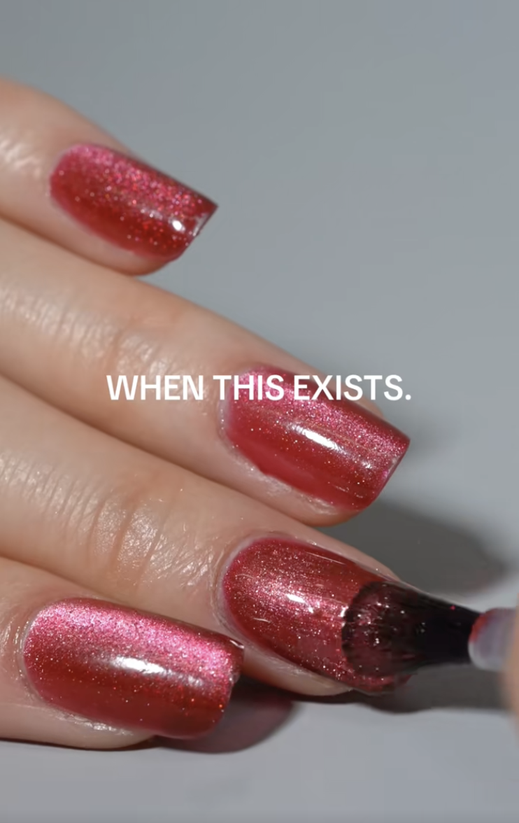
HOW TO REMOVE: One Gel Color + Magnetic (Gel Nail Polish) by Dashing Diva
-
![]()
PRO TIPS: One Gel Magnetic (Gel Nail Polish) by Dashing Diva
-
![]()
PRO TIPS: One Gel Color (Gel Nail Polish) by Dashing Diva


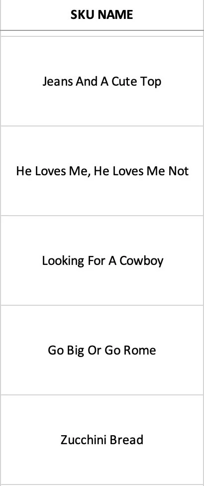
PRODUCT NAMES
-
![]()
[UNRELEASED] ARTIFICIAL NAIL LAUNCH
-
![]()
[UNRELEASED] ARTIFICIAL NAIL LAUNCH 2027
-
![]()
NEW GLAZE: SEMI-CURED GEL NAIL STRIPS
-
![]()
NEW GLAZE: SEMI-CURED GEL NAIL STRIPS
-
![]()
NEW GLAZE: SEMI-CURED GEL NAIL STRIPS
-
![]()
NEW GLAZE: SEMI-CURED GEL NAIL STRIPS
-
![]()
NEW GLAZE: SEMI-CURED GEL NAIL STRIPS
-
![]()
NEW GLAZE: SEMI-CURED GEL NAIL STRIPS
-
![]()
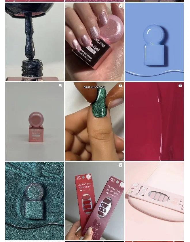
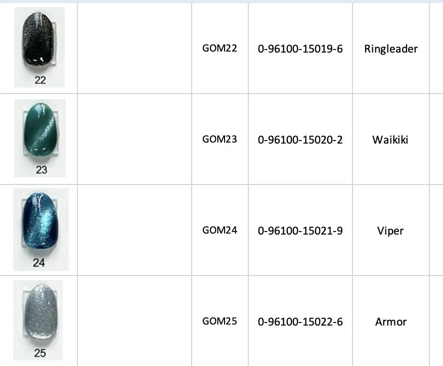
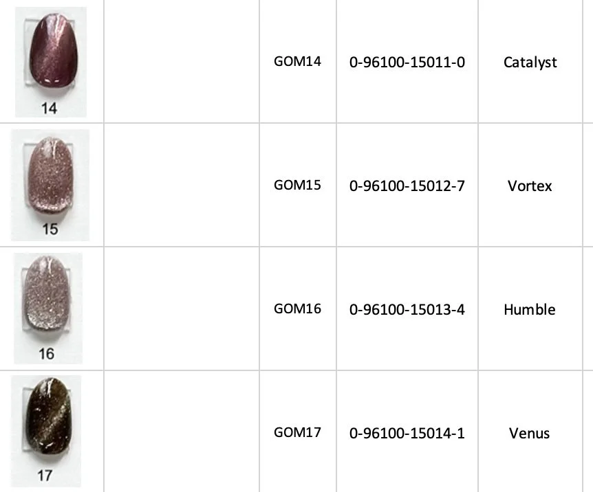
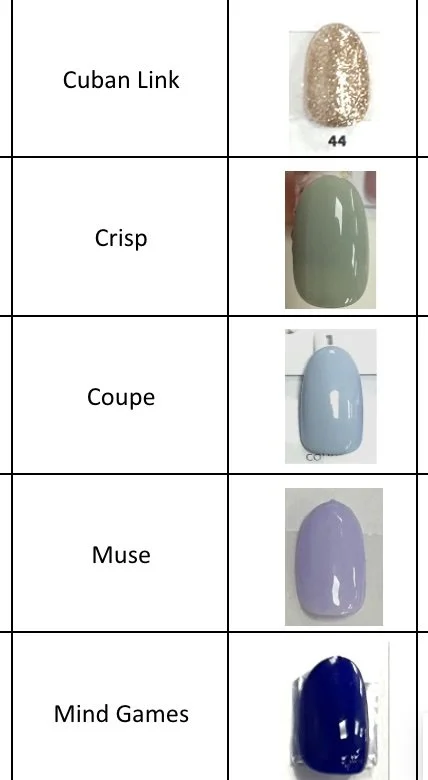
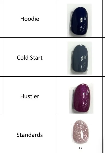
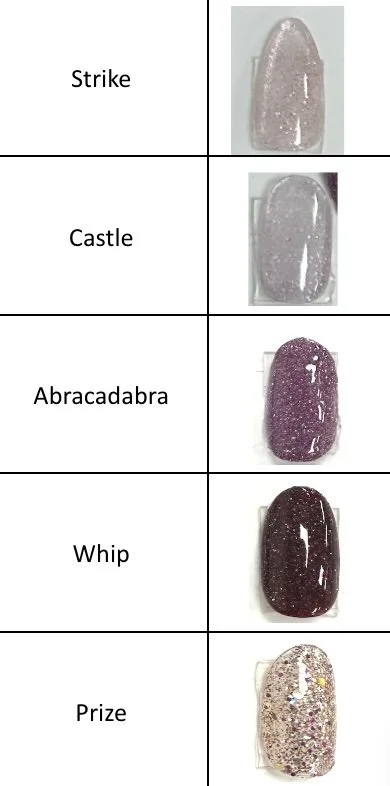
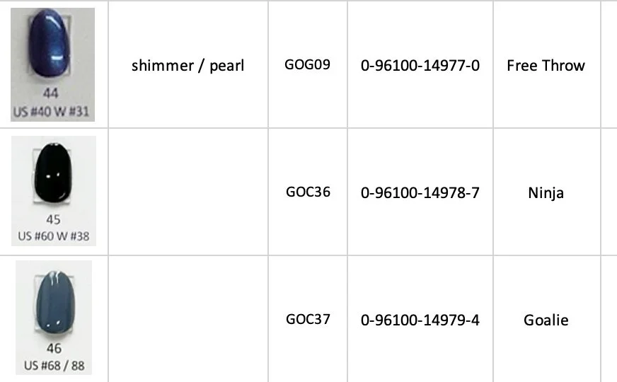
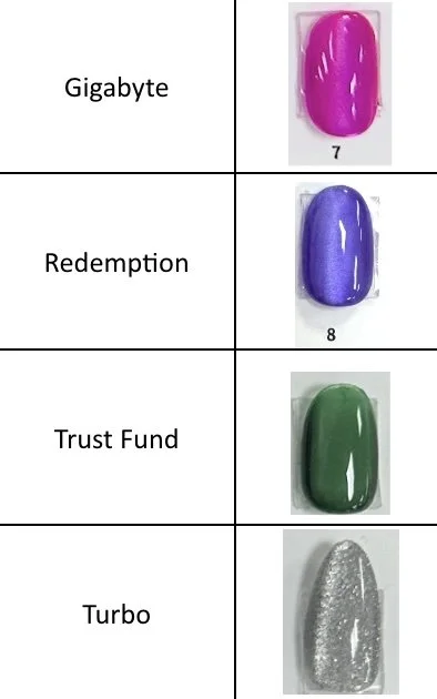
ONE GEL: GEL POLISH LAUNCH
-
![]()
ONE GEL: GEL POLISH LAUNCH
-
![]()
ONE GEL: GEL POLISH LAUNCH
-
![]()
ONE GEL: GEL POLISH LAUNCH
-
![]()
ONE GEL: GEL POLISH LAUNCH
-
![]()
ONE GEL: GEL POLISH LAUNCH
-
![]()
ONE GEL: GEL POLISH LAUNCH
-
![]()
ONE GEL: GEL POLISH LAUNCH
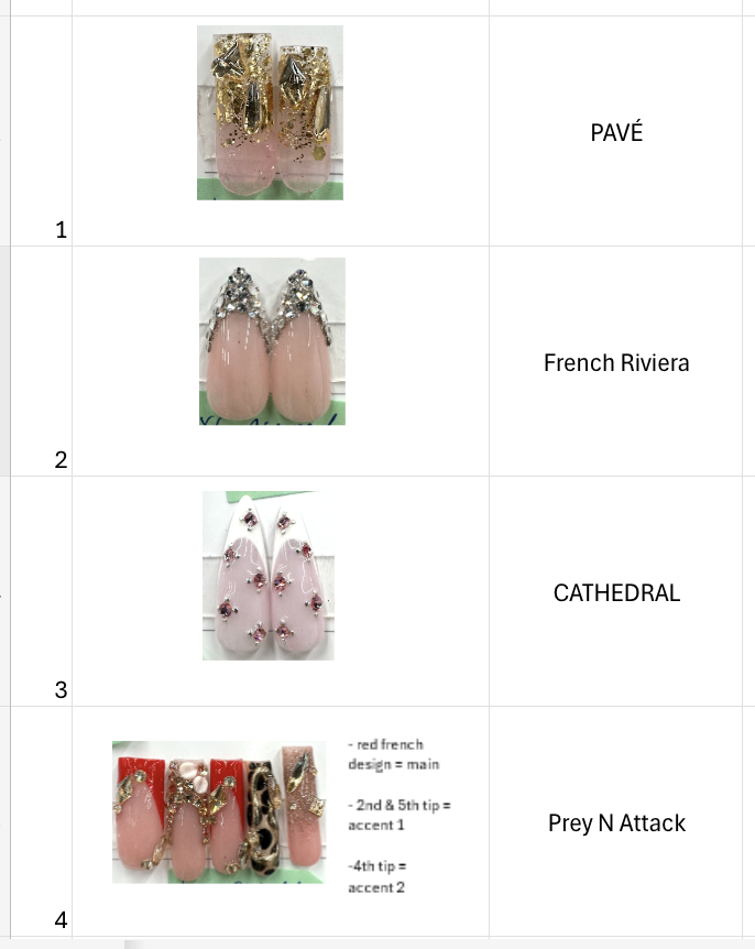
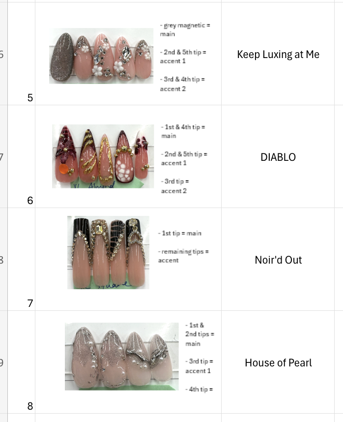
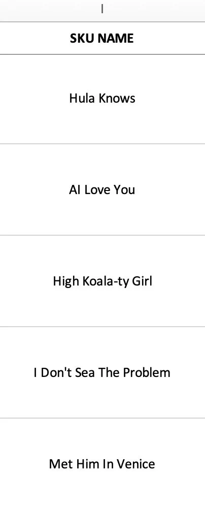
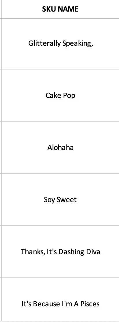
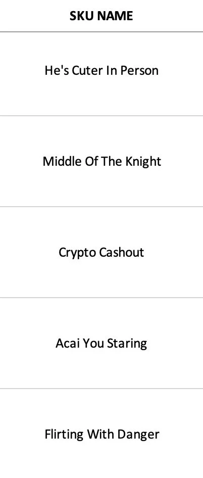
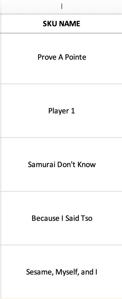
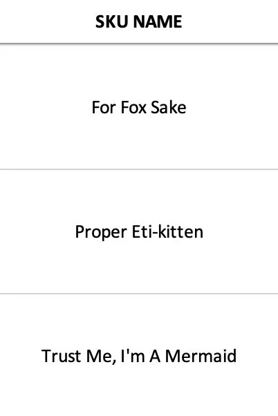

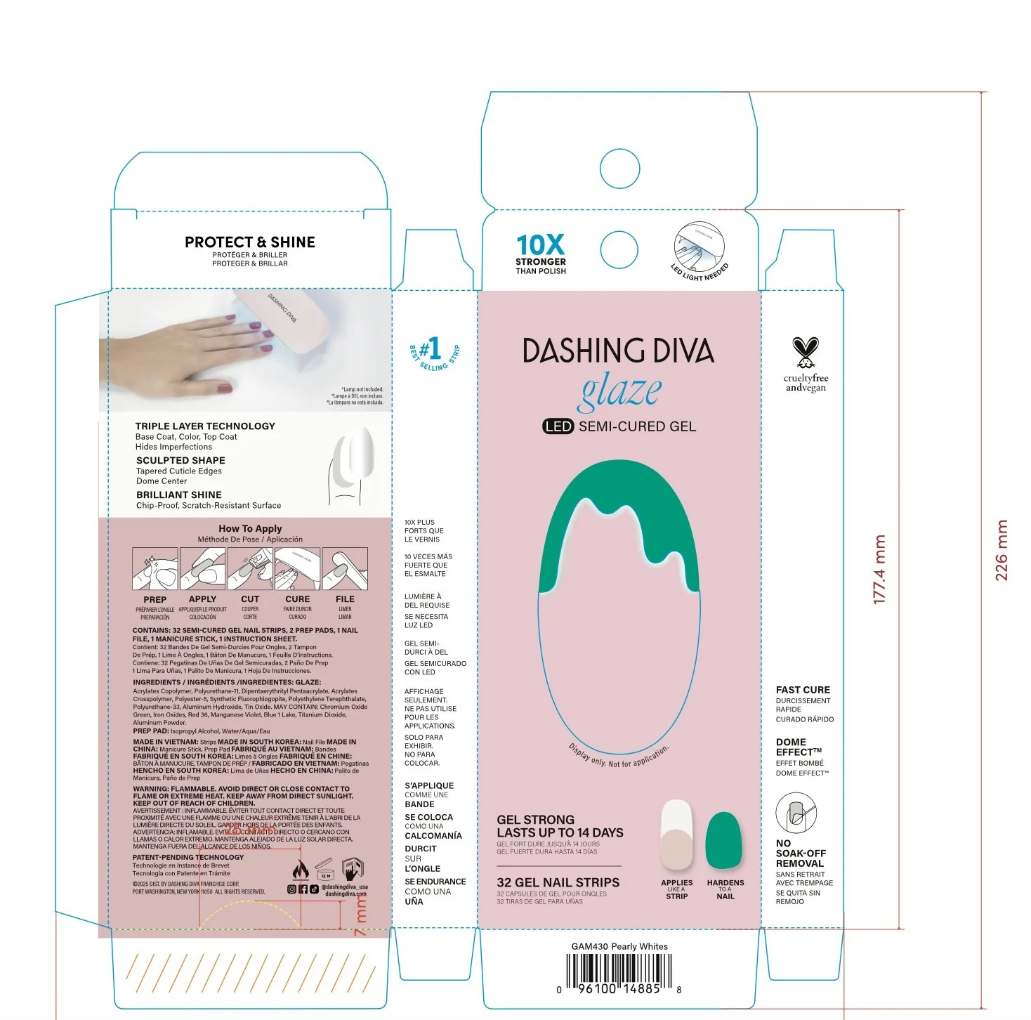
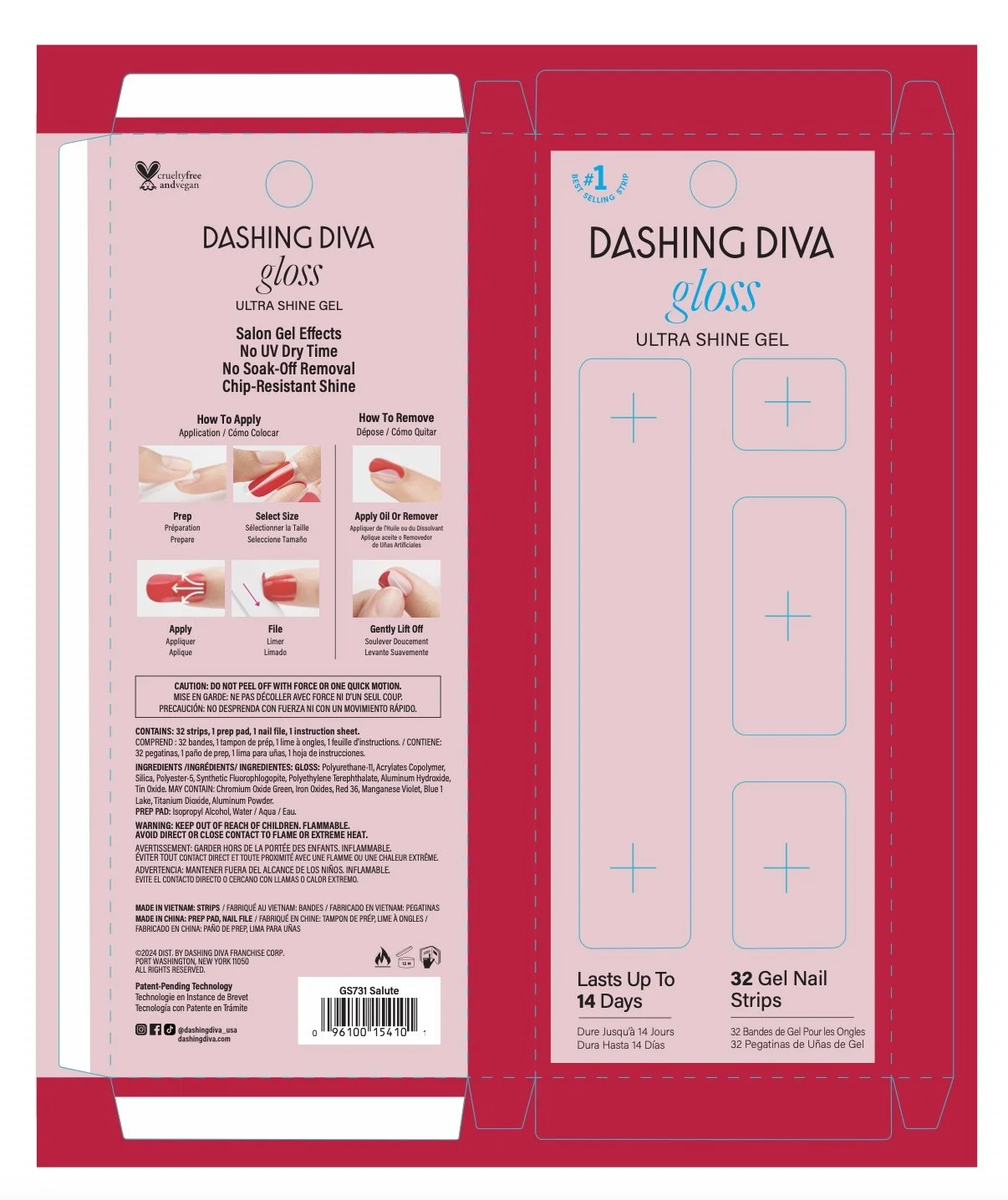
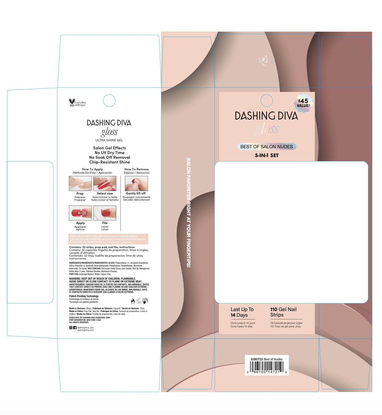
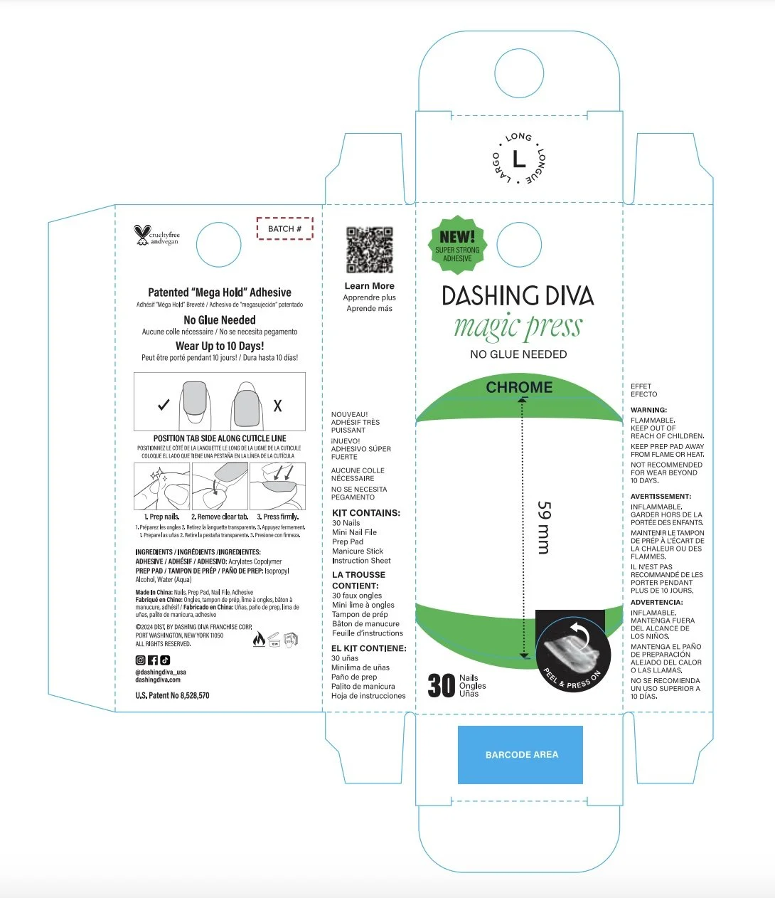
PACKAGING
-
![]()
GLAZE
-
![]()
GLOSS
-
![]()
GLOSS 5-IN-1
-
![]()
MAGIC PRESS
-
![]()
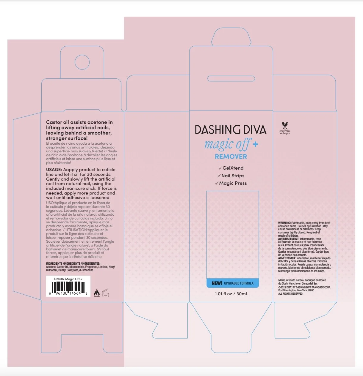
MAGIC OFF+
-
![]()
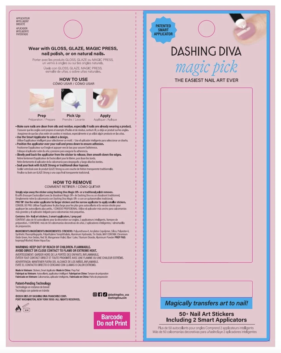
MAGIC PICK
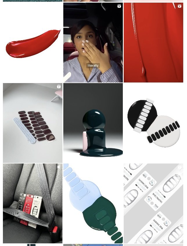
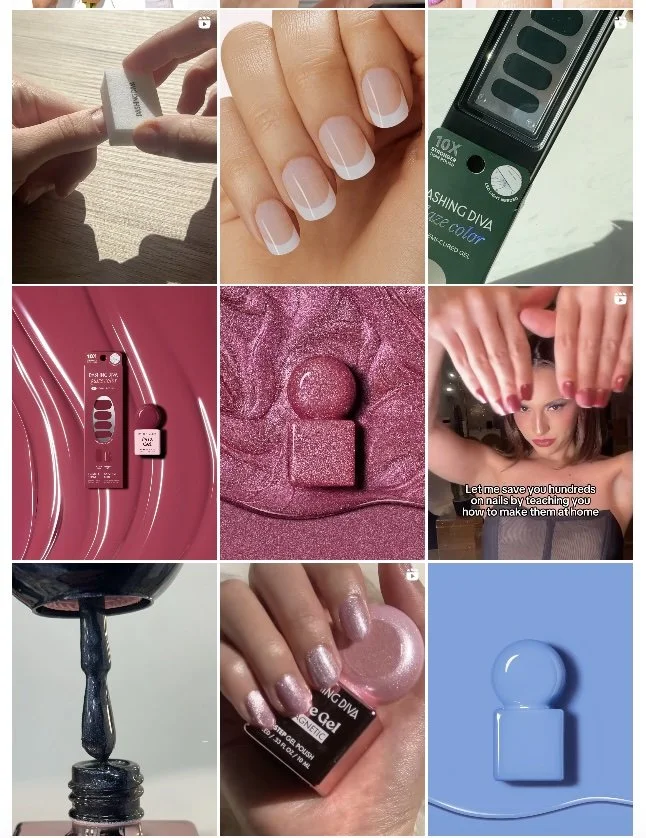
INSTAGRAM GRID